Designing Smart Urban Objects – Adaptation, Multi-user Usage, Walk-up-and-use and Joy of Use
Abstract
Designing human-computer interaction for non-personal computing devices in urban space poses different challenges than designing for personal devices. In this paper we summarize the findings from a project developing smart urban objects to help elderly people participate in urban life. We present four key challenges that have been identified designing such objects, and present first ideas for how to address these challenges. The four key challenges are adaptability (and data privacy), multi-user usage, walk-up-and-use and joy of use.
Keywords
HCI, challenges, smart urban objects, outdoor, evaluation, adaptation, multi-user, walk-up-and-use, joy of use, UrbanLife+
License
The content of this series is licensed to the public under the Creative Commons Attribution Non Commercial No Derivatives 4.0 International license. This means that you are permitted to copy and distribute this content, provided that the work is correctly attributed to the authors, the content is not used commercially, and the text is not edited, shortened or otherwise changed.
Table of Contents
- Introduction
- HCI Challenges for Non-personal Computing Devices in Urban Space
- Smart Urban Objects
- HCI Challenges in Smart Urban Objects
- Discussion / Conclusion
Table of Figures
- Fig. 1:
- Example for interactive objects in urban space from (Radwan et al. 2014) ⬇
- Fig. 2:
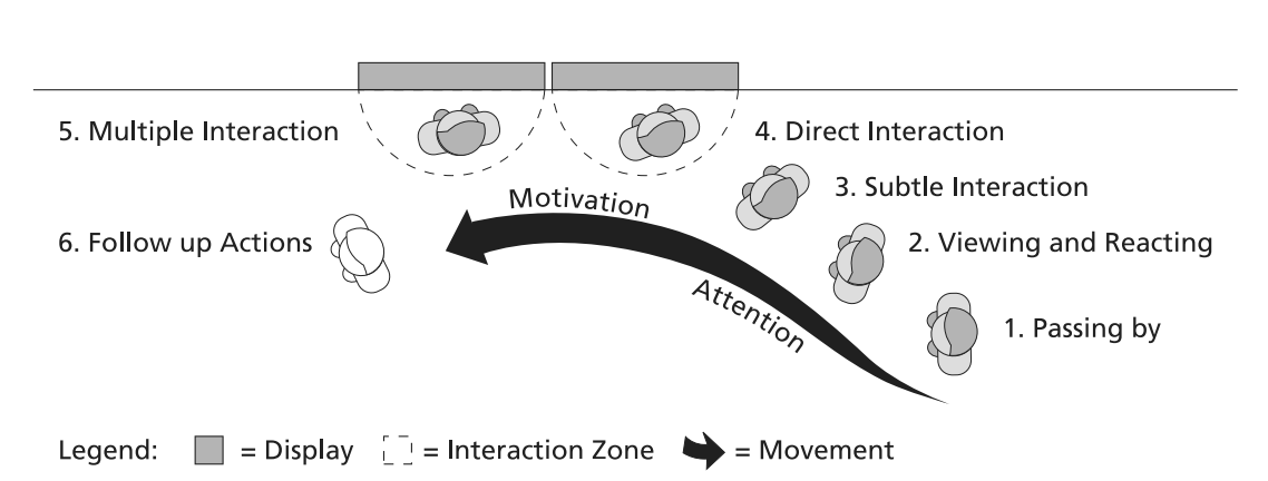
- The “audience funnel” from (Müller et al. 2010) ⬇
- Fig. 3:
- Smart Urban Objects (from top left: smart information display, smart park bench, smart bus stop, smart lighting). Render graphics: Drees & Sommer SE ⬇
- Fig. 4:
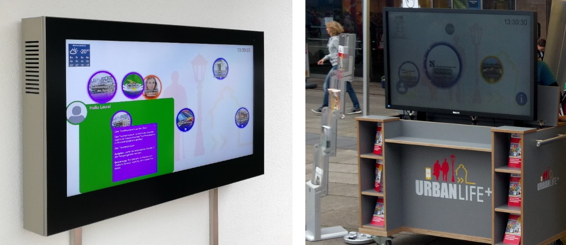
- Outdoor deployments of smart information displays. Left: Outdoor information radiator at the Senior-Scooterpark of SHMG. Right: Mobile information radiator at a festival in Mönchengladbach (Turmfest 2019) ⬇
- Fig. 5:
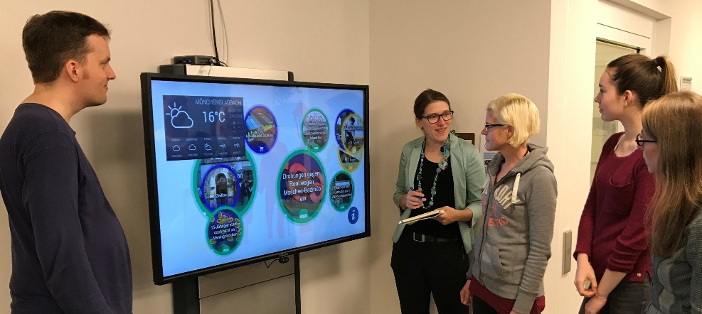
- Indoor deployment of a smart information display at a retirement home in Mönchengladbach ⬇
- Fig. 6:
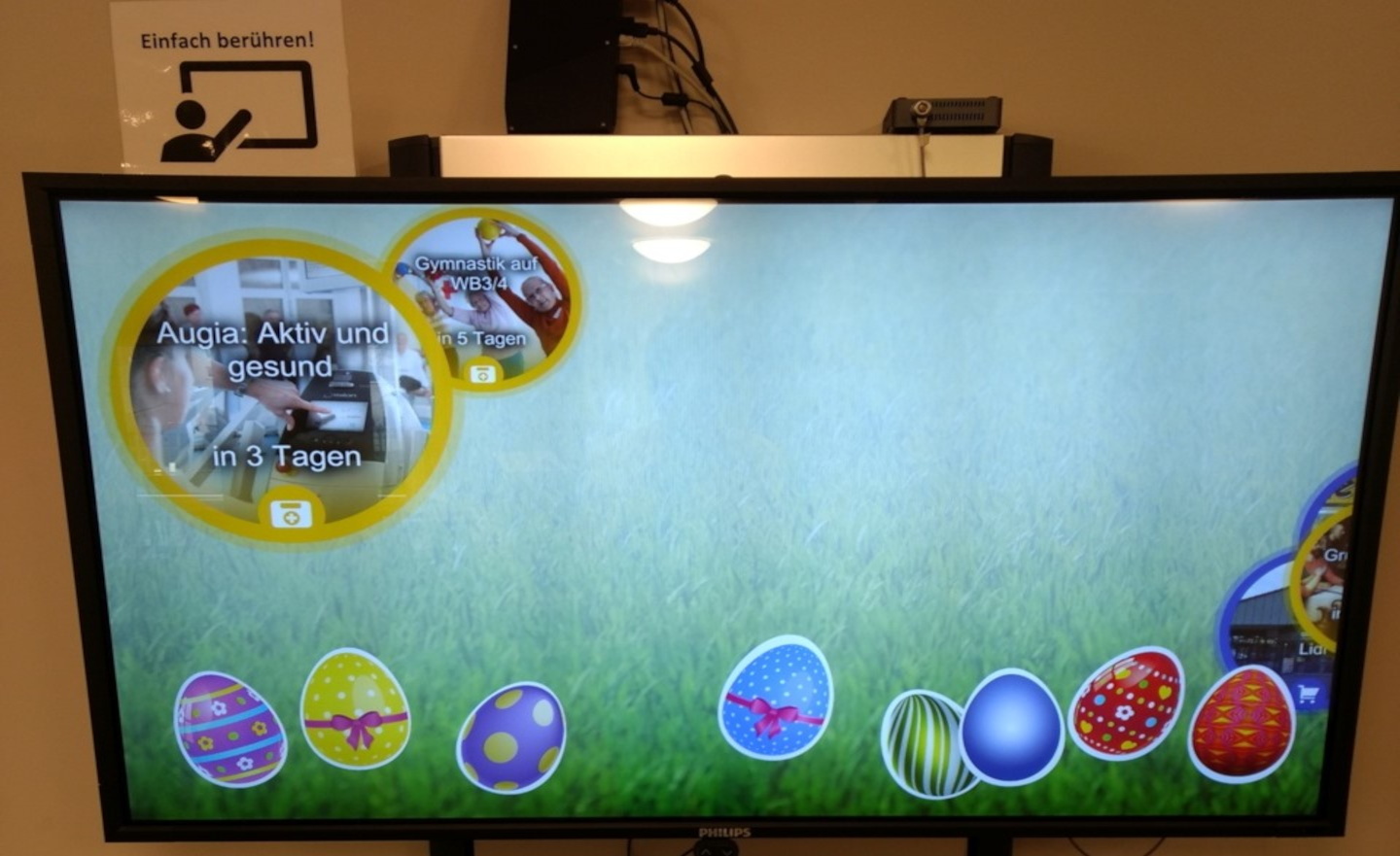
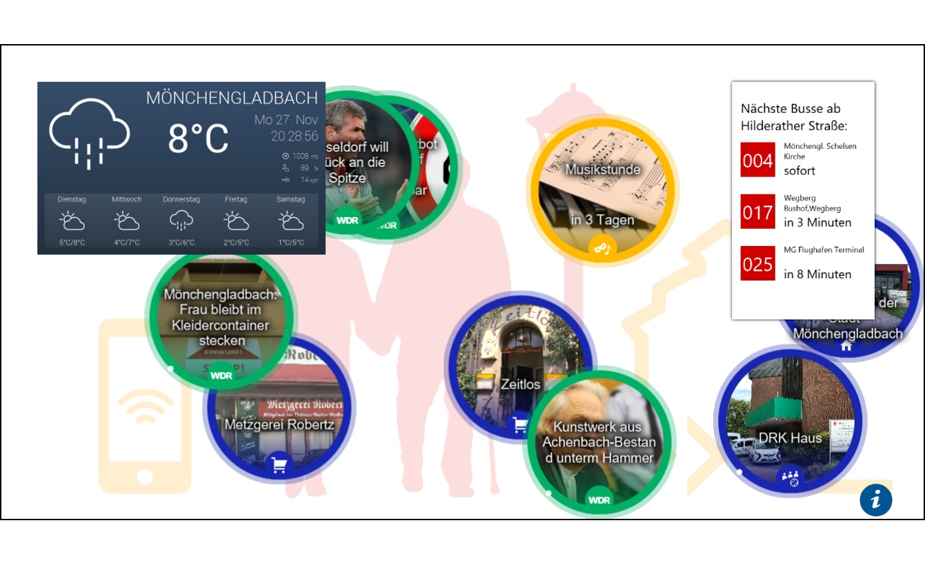
- User interface of the smart information display. Left: Easter themed interface for an event at a retirement home in Mönchengladbach. Right: Senior-friendly design mainly used in UrbanLife+. ⬇
- Fig. 7:
- Micro-Information Radiators deployed at the Senior-Scooter-Park of SHMG that are part of the SUO network which communicates with the activity support service ⬇
- Fig. 8:
- Accessible path displays that use the activity support service and micro-information radiators for leading the senior to the most suitable entrance. Concept and design: Patrick Stangl, Robert Jurisch-Eckardt, Edith Herrmann ⬇
- Fig. 9:
- Prototype of a profile configuration screen for editing personal preferences. Concept and design: Henning Hontheim ⬇
- Fig. 10:
- Start screen of the smart ticket vending machine with personalized information. Concept and design: Matthias Boger, Christian Bottek, Maximilian Wolf ⬇
- Fig. 11:
- Temporal interaction zones (based on (Müller et al. 2010)) ⬇
1. Introduction
Human-computer interaction research and design puts an increasing focus on non-personal computing devices to be used in public urban space. Important fields where this development can be seen are smart cities and urban objects (e.g. public displays).
Designing human-computer interaction (HCI) for objects in a technology-augmented urban environment poses some challenges that have not been fully addressed up to now (Stephanidis et al. 2019). These challenges result from the following differences between non-personal devices to be used in public urban space and (classical) personal devices:
- Outdoor use vs. indoor use
- Public use vs. private use
- Multi-user vs. single-user usage
- Need for In-situ and long-term evaluation (in the field)
In a five-year project1 aiming at designing and evaluating Smart Urban Objects (SUOs) for improving safety for elderly people in urban spaces, we had a chance to investigate these challenges. SUOs are elements of the urban environment, e.g. sign posts, bulletin boards and benches, which are connected to a digital information space and allow for implicit or explicit interaction in public spaces. The desired goal of our project was to increase seniors’ feeling of safety in the urban space by making these objects react to the people passing by.
In this paper we summarize some of the insights we gained during the project regarding challenges in designing non-personal computing devices for public spaces, and present examples of how we addressed these challenges in the SUOs throughout our project (Chapter 4). Before, we review related work regarding challenges (in designing SUOs) (Chapter 2). Furthermore, we present the classes of SUOs we addressed in the project and highlight some of the objects (Chapter 3).
1: The project UrbanLife+ has been supported from 2015 to 2020 by the German Federal Ministry of Education and Research under grants 16SV7438-49. In addition to Universität der Bundeswehr München, project participants were Universität Hohenheim, Universität Leipzig, Sozial-Holding Mönchengladbach, Drees & Sommer, Hochschule Niederrhein and some local application partners – See https://www.urbanlifeplus.de/ for more information about the project.
2. HCI Challenges for Non-personal Computing Devices in Urban Space
Designing computing devices for public or urban space has been a relevant topic in HCI for decades, building on work from Marc Weiser (Weiser 1991) and under the umbrella of integrating information and architecture with Roomware (Streitz et al. 1998) as well as Ambient Displays (Wisneski et al. 1998). Today, the work can mainly be found in the context of Smart Cities. Smart Cities particularly refer to the application of a wide range of electronic and digital technologies being used in communities and cities which aim to transform life and working environments (Deakin & Al Waer 2011).
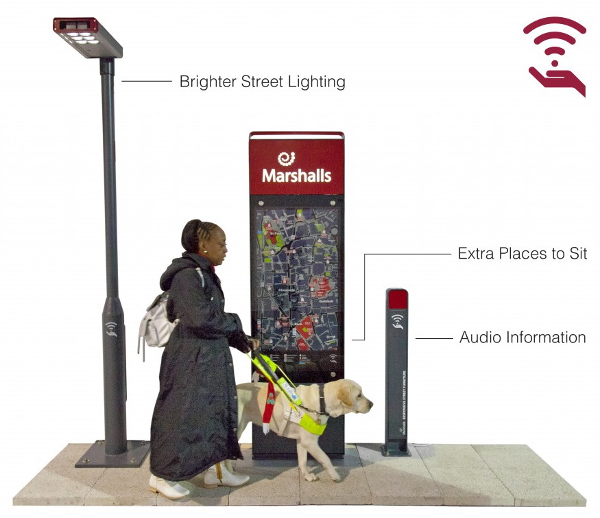
A good overview of challenges to be addressed in developing HCI for computing devices in general can be found in (Stephanidis et al. 2019). The authors list “Seven HCI Grand Challenges” – more precisely “Grand Challenges for living and interacting in technology-augmented environments”:
- Human-Technology Symbiosis
- Human-Environment Interactions (including the scenario of interaction in public spaces with multiple users)
- Ethics, Privacy & Security
- Well-Being, Health & Eudaimonia
- Accessibility & Universal Access
- Learning & Creativity
- Social Organization and Democracy
In the paper the challenges are framed quite generally – intending rather to provide a guide for research than a guide for particular system development.
With regard to their interaction with a public system, users can be characterized as passersby, bystanders, audience members, participants, actors, or dropouts (Wouters et al. 2016). A major consideration is how interactive systems can attract the attention of passersby and motivate them to engage with the system (Müller et al. 2010). Factors that have been found to motivate engagement with public systems include challenge, curiosity, choices offered, fantasy, collaboration with other users, one’s self-efficacy with technology, as well as the content and appeal of the topic of an interactive artifact (Hornecker & Stifter 2006, Müller et al. 2010, Margetis et al. 2019).
Another concern is that in public settings the boundaries between private and public interaction are “blurred” (Reeves 2011). In this respect, the design of interactive experiences in public spaces needs to provide clear and timely feedback about who is in control of the interaction and what each user is in control of. It also needs to appropriately support the various user roles in terms of (social) interaction and content (Hespanhol & Dalsgaard 2015, Hespanhol & Tomitsch 2015). The “blurred” boundaries between private and public interaction also raise privacy concerns regarding personal information that may be publicly presented, and about how such “harmless” personal information can be defined (Vogel & Balakrishnan 2004).
Privacy concerns are also raised when the urban objects have to work with personal information to provide their service. Since Streitz et al. write that “smart” is only smart if it can adapt to the user (Streitz et al. 2019), the use of some personal information is obligatory for SUOs.
More challenges can be found in reports on particular projects designing urban objects (e.g. (Gaver & Beaver 2006, Müller et al. 2012, Schiavo et al. 2013, Ventä-olkkonen et al. 2016)). Examples for such challenges are: How to design access to private space in the public environment? How to motivate users to provide information? How to attract users to use the devices?
In summary, up to now, mainly multi-user usage and personalization (as “core of smart”) and personal data privacy have been listed as important challenges when designing for urban space. However, these challenges are often discussed at a very high level. Usually, there is no transfer from the general challenges to particular design challenges or particular (urban) objects. In our research, we were aiming at closing this gap by providing a discussion of challenges identified and categorized while designing a broad set of urban objects.
In the following Chapter 3, we will present the SUOs we worked on in the UrbanLife+ project – and in Chapter 4 we will present the challenges we identified and show in relation to the objects from Chapter 3, how these challenges can be addressed.
3. Smart Urban Objects
In the project UrbanLife+ several SUOs have been explored, and challenges during their design and deployment have been identified. Fig. 3 shows some of these SUOs.
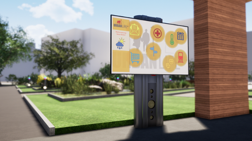
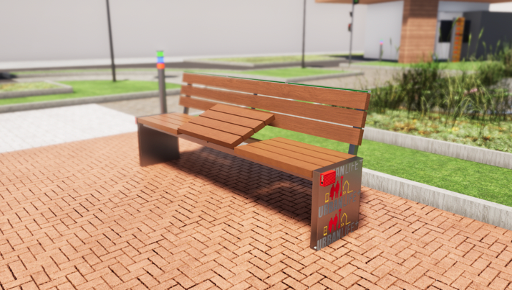
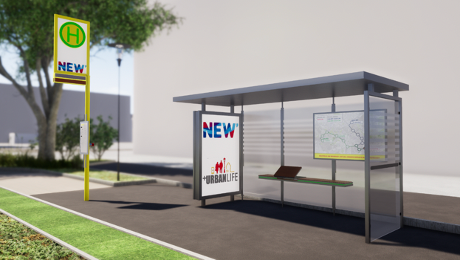
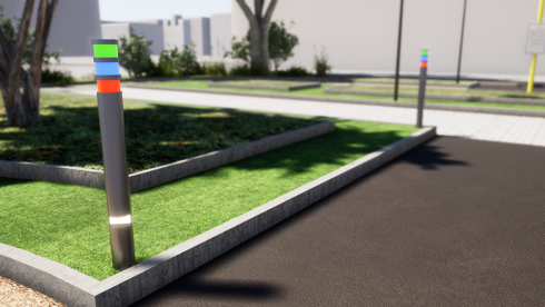
The complete and detailed list of the SUOs explored in the project is provided in the following. Additionally, in (Skowron et al. 2019), some aspects of the design space for SUOs are explored by providing an ontology for classifying SUOs.
- Smart information displays (Koch et al. 2017) – large interactive displays to provide suggestions and information
- Smart activity support – with micro information radiators, small LED or audio transmitters, to support navigation and activities – see Fig. 7 and (Fietkau & Stojko 2020)
- Smart informants – small LED or audio transmitters to caution against potential hazards (Zimpel & Hubl 2019)
- Smart signposts – small displays to help navigating in the urban space
- Smart park bench – with a possibility to make reservations (Hubl et al. 2018, Hubl 2019)
- Smart / adaptive lighting (Aleithe et al. 2018)
- Smart bus stop and smart ticket machine
In the following sections, we elaborate on some of these SUOs in more detail, in which the authors were involved in – starting with (large) smart information displays, then micro information radiators and the activity support system, followed by two more focused examples: An accessible entrance display and the decentralized identification and profile solution we developed in the project.
3.1. Smart Information Displays
In a survey conducted at the beginning of the UrbanLife+ project (see for more details (Leukel et al. 2017, Schehl et al. 2019, Schehl & Leukel 2020)), many older people cited the lack of information about services as a reason for refraining from out-of-home activities. This includes poorly accessible information about offerings in the neighborhood (What is there? Where can you go? What can you do there?) as well as a lack of certainty about what accessible paths there are and on which routes they can find sufficient rest opportunities.
By “being on the move” in the urban neighborhood, people – young and old – maintain and cultivate the image they have of their surroundings in mind. Thus, their own personal experiences are an important source of information about activities in the neighborhood, walkable paths and construction sites that may limit accessibility, etc. If older people start to stay at home more often and reduce the frequency and range of their out-of-home activities, a vicious cycle can develop:
- The less I relate to my urban environment,
- the less I get to know about construction work and other changes,
- the less confidence I have in my own ties to the neighborhood, and
- the lower my motivation for future activities outside the home.
In addition to direct experience, the most important sources of up-to-date information about the urban neighborhood are personal conversations with family, neighbors or friends, as well as the use of media such as television, newspapers and the internet.
Personal conversations about new possible activities as well as construction sites or recommendations for pleasant routes are extremely valuable but happen organically and largely unstructured. There are no guarantees about the accuracy or timeliness of the information. Moreover, such personal conversations are only possible if there is still a social connection to enough other people in the immediate vicinity, which is not self-evident.
(Mass) media allow the providers of offers more control over the mediated content in television commercials, newspaper ads, etc., but offer fewer opportunities for personalization. The content conveyed via media is aimed at the broad masses and does not consider whether it is interesting or relevant to an individual. The flood of information makes it enormously difficult to filter out the relevant content and ends in exhaustion. Seniors are particularly affected by this, as they have additional challenges to overcome, such as using technology and dealing with the medium.
We designed some smart information displays as a solution to address the stated challenges and help seniors to overcome them. The idea of smart information displays will be described in the following chapters starting with the conceptual approach and a description.
3.1.1. Conceptual Approach
The smart information displays use the metaphors of the bulletin board and the advertising pillar, which are two types of urban objects that are placed in highly visible locations to make information about offers generally accessible. Unlike their non-interactive counterparts, however, they additionally bring dynamic content presentation and possibilities for personalization of content selection and presentation.
Smart information displays (also referred to as information radiators) show information about the urban space (offers, routes, SUOs and other interesting details) continuously, which move dynamically across the screen (from left to right and vice versa). The displayed information is divided into categories (e.g. offers, SUOs, places in the vicinity, etc.), which have different colored borders and can therefore be easily distinguished from each other. Interactivity (touching and selecting content) enables exploration and the acquisition of detailed knowledge. This can be personalized by identifying individual users, as the smart information display shows targeted recommendations and motivates seniors to take action.
Compared to similar displays of information on mobile devices, the use of large wall screens allows a comparatively large interaction space and thus the promotion of exchange among pedestrians. In contrast to personal mobile devices, smart information displays also allow users to find information that they have not actively searched for. This is also referred to as “serendipity” (Ott & Koch 2019). Examples for deployed large information radiators within the UrbanLife+ context are displayed in Fig. 4 and Fig. 5, showing various application possibilities.
3.1.2. Description
By providing community-usable, medium- to large-sized interactive information displays at locations suitable for public use, the awareness and information volume of users shall be increased. With a higher level of information and awareness of other people's concerns and their own abilities, the feeling of safety when moving in the urban environment should be successively increased or maintained.
Depending on whether people are in a familiar or unfamiliar situation or environment, targeted information is presented to support challenging or less challenging activities. For example, older people receive information about the route (locations of benches, toilets, etc.), about offers in the city quarter (stores, clubs, etc.) and about current events (activities, events, news) via the information radiators. Depending on the knowledge the technical system has about the person in question, recommendations for activities can also be adapted to personal preferences as well as restrictions (e.g. only wheelchair accessible locations). On the smart information display, support for a specific activity can also be started immediately (see Section 3.2).
The experience from UrbanLife+ as well as from other projects shows that relevance and up-to-dateness are of central importance. Only if people realize that the content fits their personal life and is not outdated, such information offers will be accepted. A continuous strategy is therefore needed for content maintenance in order to ensure that content is always up to date. The combination of touch interactivity and detection of registered users on approach allows three types of interaction with the device:
- No interaction: Users can view recommendations shown on the information display.
- Indirect interaction: The smart information display recognizes the user upon approach and displays personalized recommendations.
- Direct interaction: Users explore the information space based on the displayed information – e.g. connected offers, accessible route to the destination – and trigger actions (e.g. “Take me there!”).
These information radiators are discussed in more detail e.g. in (Ott et al. 2010, Ott & Koch 2012, Nutsi & Koch 2016, Lösch et al. 2017, Nutsi 2018, Ott 2018, Lösch 2020). Fig. 6 shows various versions of the user interface of a smart information display that has been developed and used in UrbanLife+.
3.2. Activity Support
Older people moving through urban space have changing needs for assistance depending on their current situation. They usually have a goal – it doesn't have to be something as specific as a doctor's appointment or a visit to the hairdresser, it can also be exploring the new city park or spending some time in the sun. It would be helpful if the devices placed in the urban space could not only provide information and warnings independent of the destination but could also provide very concrete support for current activities. However, these goals and activities are not automatically known to the respective SUO.
In order to enable SUOs to provide such activity support, various technical requirements must first be met:
- The SUOs must be digitally connected to each other to be able to exchange data.
- A way of recognizing registered users when they approach (identification) and profile management are required – see Section 3.4.
SUOs can provide value to older people in public spaces even without networking and user recognition, but considerable potential for personalized support is lost in such isolated approaches. Instead, if the SUOs are implemented as a collaborative network, the individual objects can consider details known from previous interactions with other SUOs (e.g. the destination and the previous duration of walking activities) in their interaction with the person and adjust their offers accordingly. An activity support service was developed to perform the task of coordination and information distribution which is described conceptually and generally in the next subsection.
3.2.1. Conceptual Approach
The goal of activity support is to enable deeper and more personalized interactions with SUOs. This involves anticipating upcoming visits from registered users so that SUOs can plan and respond accordingly. In addition, information about the person's current destination, how long they have been traveling, and when the last break was taken (to estimate their current and future need for breaks) is communicated to the SUOs.
The activity support receives data on when the person passed which SUO – we do not use GPS tracking of the users, since it is sufficient to use identification data from SUOs (Bluetooth) that is already used for proximity detection.
For the determination of the SUOs' responses, mobility parameters of the person can be taken into account (e.g., information about their comfortable walking range, mobility aids used, speed on foot, known limitations of vision and hearing, etc.). The person's current destination can also be included, if known – e.g., based on previous interaction with a smart information display.
All of this information is managed by a central activity support service, which then turns it into “information packets” for SUOs on the person's anticipated path and delivers them to the SUOs.
An example of such an information packet could look something like this: “User Margot Nowak is currently on her way to August-Monforts-Str. 14 in Mönchengladbach. She has been walking for 20 minutes and has just taken a break on the bench at the bus stop Rheinstraße. Expected arrival at the park bench in August-Monforts-Strasse in about 5 minutes.” The smart park bench in August-Monforts-Strasse receives this information in advance and can react to it, e.g. by independently reserving a seat for Ms. Nowak and giving her an auditory hint that she is welcome to take a break for a moment.
3.2.2. Description
If an elderly person communicates his or her destination to the SUOs network – for example, by selecting a quest displayed at a smart information display – wayfinding assistance is provided by small information radiators – micro information radiators (see Fig. 7). These can then indicate the direction to the destination by personalizing digital signs like a pedestrian guidance system.
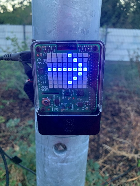
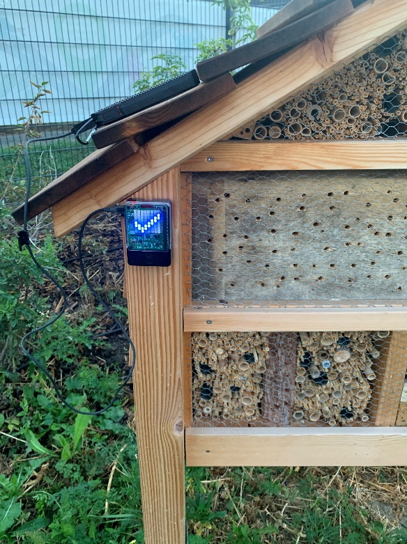
The interaction with micro-information radiators is mainly indirect as information is displayed after recognition of the user. The definition or selection of activities to be supported can take place either as a direct interaction with the smart information display, implicit through e.g., regularly recurring appointments or by other means (e.g. via mobile applications).
A prerequisite for such navigation support is an area-wide placement of SUOs so that there are no spatial gaps in the support and seniors are always accompanied. If all SUOs can communicate with the central activity support service, the benefits in personalized support will be enabled. For example, micro-information radiators can display their navigation cues in the personally selected color and explicitly address the needs of the individual senior (e.g., duration of visual signal, brightness, animation speed).
More details on micro-information radiators can be found in the first scenario of the publication of (Kötteritzsch et al. 2016) as well as in (Fietkau & Stojko 2020, Stojko et al. 2020).
3.3. Accessible Path Display
Many older people need accessible entrances to public buildings, for example because they can no longer climb steps or use aids such as a walker. However, the accessibility of a building is often not immediately obvious, for example because it is located on the rear side of the building out of sight. There may also be different access options depending on the exact abilities of the visitor.
Regarding this issue, we want to describe a solution which is a special case of activity support. The activity support – i.e., support of moving to the accessible entrance – is automatically activated by approaching the building (and identifying the user in need of assistance). The assistance for navigation is provided by micro-information radiators positioned there.
The navigation can also be personalized according to individual requirements. For example, it is conceivable that they navigate to the most suitable entrance depending on the available parameters (wheelchair, walker, e-wheelchair), if a building has several entrances that are designated as accessible. The illustrated example (Fig. 8) shows the floor plan of a church and the navigation instructions of the individual micro-information radiators pointing to the most suitable accessible entrance.
3.4. Decentral User Profiles and User Identification
To fulfill their task, SUOs require information about their users (see Section 4.1: something is only “smart” if it can be adjusted to individual users). A central solution for fulfilling this requirement – e.g., via a central profile service – is often rejected by users. The justified distrust of central storage of their data can be countered by a decentralized profile store on a user's own personal device.
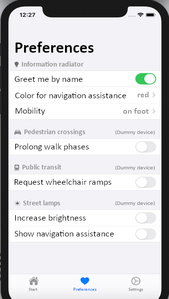
The user profile is completely stored on the user's mobile device and allows independent control and handling of personal data. The profile includes the ability to edit profile information and set preferences for the usage of profile information – e.g. restriction to certain types of services. Fig. 9 shows a configuration screen of our prototype implementation. Valuable input for SUOs is a broadly defined user profile with information on interaction preferences, perceptual limitations, and motor disabilities. Furthermore, an important profile value is the comfort zone (Kötteritzsch et al. 2016) – a representation of the areas in which the user feels comfortable, derived from past activities. One goal of the overall system is to expand the comfort zone and give seniors more room to maneuver in their environment.
In addition to the modeling of profile information, the user identification is a relevant aspect as well. For the identification of the users, we use the Bluetooth LE protocol via mobile devices (or iBeacons). SUOs offer a Bluetooth interface permanently to which mobile devices of passersby can enroll. The usage can be described as follows: The elderly users carry their device (e.g., smartphone) with them and have a BLE Central implemented – i.e., an application that reacts to recognized SUOs and exchanges data with them. Thereby the SUOs know who is close to them and what impairments they have. This allows SUOs to respond to the individual user in the best possible way.
3.5. Smart Ticket Machine
A flood of information and obscure fare structures regularly cause many people – especially the elderly and physically impaired – to despair when buying tickets. To help users overcome these challenges, we designed a personalized ticket vending machine. Elderly users with a low perception of self-efficacy and people with visual impairments should receive important information quickly and easily through this individual adaptation.
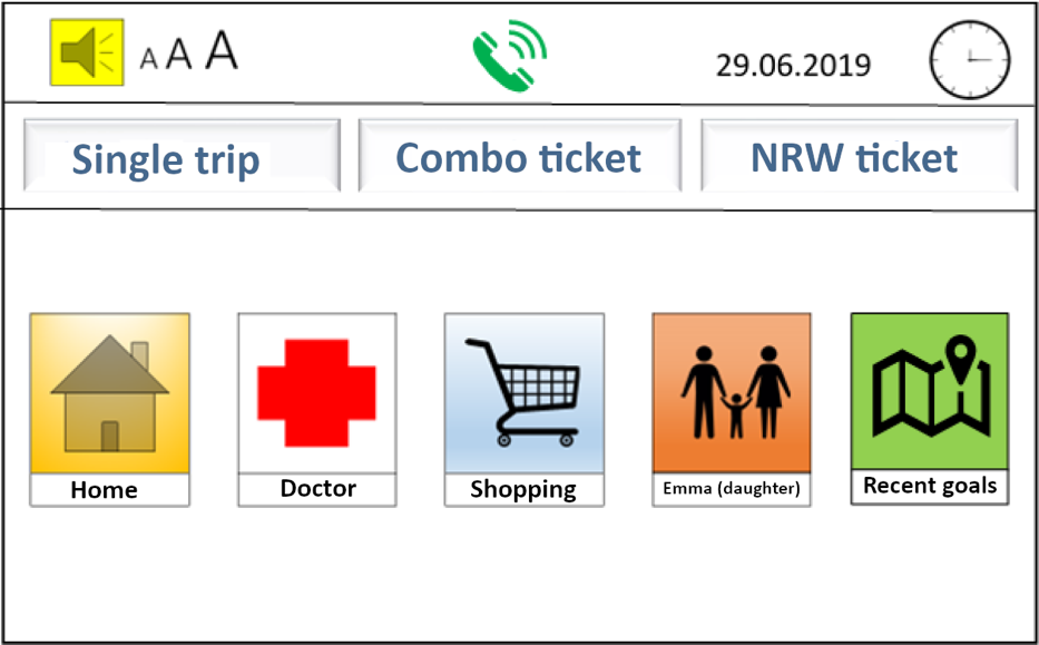
The concept is a smart ticket vending machine that uses proximity detection to recognize when a person – who is registered in the system – is standing in front of it. In this case, the vending machine accesses the stored profile and personalizes the selection options on the start screen based on the profile. This makes it possible to quickly book tickets to known destinations, e.g. home, visiting relatives, or to a popular shopping destination as this information was stored in the profile.
The start screen (Fig. 10) is not only personalized in terms of content, but also in terms of design. The size and contrast of elements such as icons and text are adapted to known visual impairments. Audio output can also be provided. In any case, the design is clear and intuitively understandable.
In addition to cash payment at the machine, billing is also possible via the user profile. This means that the amount due can be transferred conveniently from home or paid directly by direct debit.
4. HCI Challenges in Smart Urban Objects
As we have presented in Chapter 2, in our research, we were aiming at closing the gap between high level challenges and low-level design of SUOs by providing a discussion of challenges identified and categorized while designing a broad set of urban objects.
When looking into the properties of urban space, we encounter prerequisites for interaction that should be taken into consideration:
- Interactions can take place at any time of the day or night.
- All demographic groups in the urban space can be attracted by and interact with urban objects – often several at the same time.
- Usage of the urban objects is voluntary and should not require any training at all.
These properties lead us to the challenge of walk-up-and-use, and due to the voluntary usage to a need for joyfulness in the use (to improve motivation to use).
If we add these two challenges to the challenges already identified in Chapter 2, i.e. personalization and data privacy and multi-user usage we get the following list of challenges:
- Adaptability (personalization and personal data privacy): to enable personalizing the interaction with the devices
- Multi-User usage: to provide the possibility for multiple users to use the devices (at the same time)
- Walk-Up-and-Use: to enable intuitive use of the device, i.e. the possibility to use the devices without reading manuals or performing setups
- Joy of use: to allow for playfulness, i.e. to make using the devices fun
In the following, we will briefly address how these core challenges may be addressed in general and have been addressed in particular in some of the developed SUOs in UrbanLife+.
4.1. Adaptability (and Data Privacy)
In general HCI, the adaptability of a system is considered fundamental for usability (Heinecke 2012). In public space – which is characterized by a lack of control of users and conditions of use – heterogeneous needs meet. The fit senior citizen in his mid-80s should be just as much addressed by technology as the 60-year-old wheelchair user. When involving people of different sizes, cognitive capacities, interests and motor skills, HCI must allow for diverse models of input and output, adapted presentations and changes in content and structure.
There is a lot of research on adaptivity in HCI. Starting with early work by Brusilovsky on adaptive hypermedia systems: “by adaptive hypermedia systems we mean all hypertext and hypermedia systems which reflect some features of the user in the user model and apply this model to adapt various visible aspects of the system to the user.” (Brusilovsky 1996)
So, there has to be a user model and adaptivity on different levels: From changes in procedures or structures in the system (pragmatic level), via changes in the content with which the user interacts (semantic level), changes in the basic interaction with the system (syntactic level), changes in the presentation of information (lexical level) to physical changes in input and output (sensomotoric level).
For our SUOs we first have defined a rich user profile including interaction preferences, restrictions on perception and motoric disabilities. Then we address the issue of privacy control when this profile is made available to SUOs by storing only highly sensitive personal data on mobile devices – not at a central storage – and restricting its use to the minimum necessary exchange between SUOs and profile service. One important profile value is the comfort zone – we derive from past activities – to motivate activities (Kötteritzsch et al. 2016). So, in our experience the issue of data privacy that was often stressed by the authors mentioned in Chapter 2, is closely related to this issue of adaptability.
For smart information displays or the smart bus stop we have provided adaption of the information displayed and of the modes of interaction with the display – including the possibility to physically lower the display (when approaching it in a wheelchair).
For smart activity support we have tried displaying different symbols and allowing different forms of interaction based on the user profile. Smart informants should only point to dangers that are dangerous for the person approaching, smart signposts can display different directions according to the abilities of the user (e.g., different accessible paths).
In terms of privacy and information sovereignty, one of our major design decisions was to avoid general location tracking techniques (such as GPS or other device vendor location services), instead relying only on proximity detection of users near the SUOs (which have a known position). This goes a long way towards avoiding the impression of user tracking, as proximity detection is necessary for personalized SUO interactions anyway and thus unavoidable. It also makes it easy for the user to disable all location tracking by toggling a switch in our mobile app or by turning off Bluetooth.
4.2. Multi-User Usage
“As computation gradually becomes part of everyday physical space, the spatial context within which interaction between humans and computation takes place radically changes from a fairly static single-user, location-independent world to a dynamic multi-user situated environment”
All urban objects can be used by multiple users after each other, most of them even by multiple users at the same time. The multiple usage does not have to be coordinated. Also watching a public display by one user from a distance while another user is interacting with the display is multiple usage. Challenges stemming from the need to serve different users simultaneously include the balance between the single-user and multi-user contexts, and the facilitation of collaboration among multiple users who may be strangers (Ardito et al. 2015, Lin et al. 2015).
In the UrbanLife+ project, we found the most difficult issue is that most devices can be seen by more than one user at a time. That is true for large smart information displays (several users standing in front of a screen in different interaction zones) and for small devices like micro-information radiators or lamps in a smart lighting scenario.
One example of work on multi-user capability concerns the investigation of which directions of movement of text on the screen provide the best legibility. The use of moving text on the screen is motivated by various recommendations to use animations to attract or enlarge the attention of users (e.g. (Huang et al. 2008)). Classically, it is assumed that leading – i.e. moving a sequence of words from right to left – is the optimal animation method (So & Chan 2009). However, this work does not take into account that 1) the view of the screen may be partially blocked by other users, and 2) users may not stand rigidly in front of the screen but may move around while viewing the screen itself. In a laboratory study, we therefore ran through these scenarios with different directions of movement for text and determined the variant that offers the best subjective readability (Nutsi & Koch 2016). The result of previous experiments was that the typical text animation direction (right to left) is not always the best choice. When a user is standing in front of the screen, it has been shown that the best results are achieved when the text is animated vertically (from top to bottom). For moving users, it has been shown to be optimal if the text moves with the user (in the direction of movement).
For the large smart information displays we also looked into personal areas to be displayed for different users and into differently addressing users to the left or to the right of the screen.
For micro-information radiators we looked into using different colors for different users. However, this proved not to be ideal when several users are addressed at the same time. We had to limit to addressing the nearest user – which in itself is hard to determine since it is not only up to the physical distance, but also due to who can (better) see or faster approach the device.
4.3. Walk-up-and-use
Walk-Up-And-Use refers to the characteristic of systems that they can be used immediately without the need for introduction or study of a manual. This includes, firstly, an intuitive user interface, but also drawing attention to the systems and making potential users aware that the systems are interactive.
Intuitive usability was defined as, for example: “A technical system is intuitively usable if it leads to effective interaction through unconscious application of prior knowledge by the user” (Mohs et al. 2006). Raskin addresses the connection between intuitiveness and familiarity even earlier (Raskin 1994). However, the concept of the intuitiveness of user interfaces has not been finally clarified (Herczeg 2009).
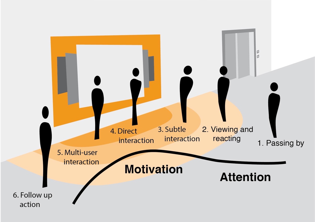
In the context of smart information displays for example, we specifically address the question of how someone who walks past the screens can 1) be made aware of the screen and the interactivity of the screen, 2) be motivated to approach the screen, and 3) be motivated and enabled to perform beneficial touch interaction with the screen. The model is based on temporal zones of interaction (see Fig. 11).
In our project we experimented with different ways to communicate the “how-to-use” to our users. The simplest was a text sign on a large smart information display that points to the possibilities of interaction. More potential was identified in showing a personal information area and playing a personal audio greeting when the device was approached.
The best solution for intuitive usability often was, if the result appeared without the need for explicit interaction – i.e., if the users “only” had to approach the devices. But even then, the result had to be “intuitive” with respect to interpretation and understanding. An analysis of the walk-up-and-use design of the smart activity support system is provided with a process description:
- The user starts at the large smart information display which shows a personal area and suggested activities for the approaching senior. Here, we decided to use touch interactions and use drag-and-drop to add the desired activity into the personal area. This personal area appears without interaction required, as the senior is identified by Bluetooth signal (for more details see Section 3.4). While the personal area speaks for intuitive design, the activity selection by drag-and-drop may be challenging for some seniors. This still has to be analyzed by evaluation.
- After selecting the activity, the senior starts with its execution and receives support without explicit interaction by micro-information radiators in the urban space. Those use proximity detection via Bluetooth to enable this intuitive interaction. However, we identified that for making the information as understandable as possible, it is important to use standardized symbols (e.g., conventional arrows) and sounds or vibrations with known meaning for the user (e.g., their personal color or selected personal sound).
4.4. Joy of Use
Joy of use is a sub-topic of the design of interactive systems, which has occasionally appeared in the HCI literature since the late 1990s. Roughly speaking, it describes the extent to which interaction with a technical system can trigger feelings of joy, happiness or fun in the user. Unfortunately, there is no uniform and generally accepted definition. Probably the best known and most frequently cited attempt to define the term today is (Hassenzahl et al. 2001), although there have been other efforts to systematically develop the term, e.g. (Hatscher 2000). A successful overview of definitions proposed up to the time of publication is provided in (Reeps 2004), who also discusses a number of neighboring terms (e.g. gamification, funology) and their delimitation.
An interesting question, but one that, according to our own research, has not had its research potential tapped very deeply, is that of linking joy of use and the methods associated with it with technology in the public space. Especially in older HCI publications, the single-user context in private or professional environments is often implied. For the UrbanLife+ project, however, joy of use in public spaces is particularly interesting, including everything that goes along with it because it requires new interpretation for the elderly as a user group (such as the spontaneous gathering of several users who want to interact with a system at the same time – see also section on Multi-User usage, or e.g. theoretical work on the design of prosocial game experiences (Cook et al. 2016)).
That is not to say that there is no other work on joy of use in public spaces at all. Strands of research have recently coalesced around the terms “playable city” (Nijholt 2017) and “urban gamification” (Thibault 2019). Research challenges in these areas often mirror those of other urban technology deployments – how to operationalize user attention and engagement, how to gather data about users’ perceived emotional experience, etc.
In UrbanLife+ we designed and implemented a gamified reward system for urban exploration based around the game element of “quests”. Senior users would be presented with opportunities for urban activities (outside their comfort zone if possible) such as visiting a specific café, museum or social gathering. If they successfully completed such a quest, they would receive a small but tangible reward, such as a voucher for their next visit or a free cup of coffee. This idea draws upon existing research on both economic incentive systems (c.f. loyalty programs such as “Payback”) and personal narratives driven by self-determination (“being the hero of your own story”). This concept is described in more detail in (Fietkau 2019).
We conducted a brief empirical evaluation of this system prototype in the form of user tests and qualitative interviews with seven participants, some of whom were seniors (four persons older than 60 years) who were asked to judge from their own perspective, and some of whom were experts from the field of geriatric care who were asked to speak from their professional experience.
Within our interview group, we observed a diversity of opinion regarding material rewards as a potential motivator. Some subjects were immediately taken with the “prizes” and explicitly noted them as important motivation for activities outside the home, others showed indifference, or in one case even clear rejection.
Independently of the rewards, the participants showed a broad acceptance of the quest concept. The motivating function of the quests as a way to structure offers was repeatedly judged as positive not only for their own experience, but also hypothesized to be helpful for other elderly users in the context of society.
It should be noted that joy of use is not limited to gamified experiences. For example, during sessions with seniors using interactive technology, we were able to observe that highly joyful reactions (a powerful motivation to overcome fear of technology) were sparked by showing photos of people or places that the seniors could recognize. One resulting design – which was implemented as a prototype but ultimately not pursued for empirical research – was a digital jigsaw puzzle that allowed senior users to assemble photos of their social group or of places outside their home.
Another lesson we learned about joy of use was, that it is closely related to the purpose of the object. “Using” an object is not considered a burden, if it is purposeful – in our case, if the user gained additional safety by using the object.
5. Discussion / Conclusion
In this report we briefly reviewed challenges for designing objects for urban space – and particularly presented experiences we gained in designing SUOs for improving the safety of seniors in urban space in the UrbanLife+ project.
We found the most important challenges to be adaptability (including data privacy), multi-user usage, walk-up-and-use and joy of use. While other papers have presented a much broader view here (e.g. (Stephanidis et al. 2019)), we found that our four challenges are more practical – they provide direct issues to look at when designing systems. That helped us a lot in the project.
There is a lot that can be done now – each of the four challenges could be addressed in a separate book. We will continue to use this thematic structure for presenting and discussing the challenges and the possible solutions in one particular class of SUOs: The information radiators – both large smart information displays and micro-information radiators.
One final remark about seniors as user group: We found that the need for addressing our four challenges is not unique for this user group – however, some challenges are different for seniors than for other user groups. One example for this is walk-up-and-use. As noted by other designers and researchers, we experienced that seniors in general are much more reluctant to use technology than other user groups. But even for this issue we found that providing a real benefit and presenting the objects in settings such as focus groups helps to overcome this challenge.
Bibliography
List of Authors

Prof. Dr. Michael Koch
michael.koch@unibw.de
www.unibw.de/inf2/personen/professoren/univ-prof-dr-michael-koch
Prof. Dr. Michael Koch studied computer science at the TU Munich and received his doctorate in the subject. After an industrial stay at the Xerox Research Centre Europe and subsequent habilitation in computer science again at the TU Munich, he now teaches at the University of the Federal Armed Forces Munich where he holds the professorship for Human-Computer Interaction.

Anna Buck
anna@koetteritzsch.net
www.koetteritzsch.net
Anna Buck (née Kötteritzsch) studied Applied Cognitive and Media Sciences (M. Sc.) at the University of Duisburg-Essen. Until 2019, she worked as a research assistant in the UrbanLife+ project at the University of the Federal Armed Forces Munich. Currently, she is working in the field of IT training.

Julian Fietkau
julian.fietkau@unibw.de
www.unibw.de/julian.fietkau
Julian Fietkau studied computer science and human-computer interaction at University of Hamburg, then worked for a year as a research assistant at Bauhaus University Weimar until he joined Universität der Bundeswehr München in 2016. Since then, he has been working as a PhD student with Prof. Dr. Michael Koch in the field of human-computer interaction, especially with regard to the research project UrbanLife+.

Laura Stojko
laura.stojko@unibw.de
www.unibw.de/inf2/personen/wissen_mitarbeiter/laura-stojko
Laura Stojko studied Information Systems at the University of Regensburg (Bachelor) and at the Technical University of Munich (Master) and has been working on her PhD in Human-Computer Interaction with Prof. Dr. Michael Koch at the University of the Federal Armed Forces Munich since September 2019. She is a research assistant and supports in teaching and research projects.